Friday 16 December 2011

Thirsty Work.....

Beer Can 3
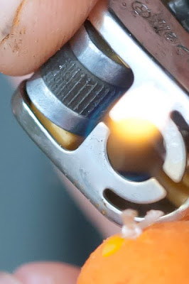
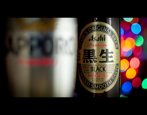
I felt all Christmassy today, what with just a week or so to go. The tree is up and the fairy lights are glowing so what better way to complement these festive accoutrements than to photograph them with the essence of crimbo, beer!!...

...Actually, it's a shot for an on-going Flickr project about a beer can I bought and this is the latest in the series - click through to read the hows and whys.....

Thursday 15 December 2011

Two become one....

I've been light painting like mad, partly because it's my new 'fad', but also because the weather has turned and outdoor features have been cancelled or just not booked due to rubbish fishing conditions. So I've been drafted in to help out with studio shooting for our advert production department.

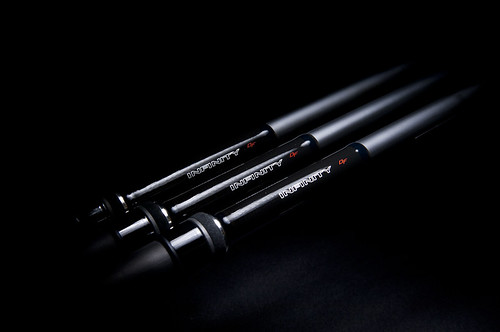
There were some rods in for photography that would run in a corporate style advert for one of our retailer who has an in-house brand. It's a nice position to be in when you're asked to help out a key advertiser who's going places in what is currently a hard market to be in, recession and all that. Plus, it helps to remind people that I'm not just good for shooting outdoors!..

The ad team needed a single shot as the advert's main image and they'd already tried shooting against white but didn't like the result. So I suggested black background they went with it because it fitted with that slicker, corporate feel they wanted to get over in the advert.


So the shot started off with a bit of light painting using my trusty phone screen. exposure was 25sec at f/8. The length of the shutter speed allowed me to make sure I covered enough of the graphic, and the aperture made sure there was good sharpness. The client wanted it to run over a full DPS and it was decided that the whole graphic needed to be sharp, so shallow DoF was out of the question.

This was the best of three shots; the other two had patchy lighting (where I'd hovered with the phone for too long in one spot) and just didn't quite look right in terms of the way the light pool fell off. I outputted through Lightroom 3 into Photoshop to get it ready for the second layer, but not before cooling down the white balance so it would work well against the warmer light of the flash (original WB was 5500K, I changed it to 4400K).


So next was the shot using flash. I knew i needed a fairly strong highlight to left the top edge of the rod out from the black. Painting with the phone couldn't provide this because of the problems with a light source facing the lens (you get a ghosting of the screen moving) so i had to return to using flash. Of course, the beauty of merging shots is that as long as the camera stays put so the second image is identical in position, settings can change to allow flash on a much shorter exposure. I tried it on a long exposure, pressing the test fire button on my flash set to 1/64th power.

But it just didn't look right; it was hard to to move the flash along the blank without it being in shot and by doing it in bursts, I wasn't sure I'd nail a highlight that would authentic. In the end I settled for a flash out of shot set on a narrow beam, fired by a trigger with the camera on f/9 at half a second. The highlight isn't even because of light drop-off, but I don't mind that - it was easier to achieve it this way in one go. As you can see the highlight also catches some of the foam on the handle.


The merge was pretty simple; stack the layers in photoshop and just use a mask to 'uncover' the softer light pained shot. I did a fair bit of low opacity brushwork to avoid killing the highlight totally and finished off with a full selection (with a 150px feather) on the black areas before filling them with maximum black. This was to allow extension of the image using black to move it around the page so it could be shrunk.

The designer, Steve (a guy who's really getting into photography himself), was really happy with the result. I like it too, although I think there's so much more that can be done with mixing flash and painted light, and I think where highlights and rim lighting are concerned, it's the best way to attain a good result.


Tuesday 6 December 2011

Want to win at this game? Always bet on black.....

Yeah, yeah, it's another naff title but it kind of sums up a part of my job as a photographer.

Aside from the location shoots, I have to do studio work for our various magazines, the majority of this type of photography relating to products that are sent in for testing.

My last post was about lightpainting and how I'd use it in a work situation but more than anything, that post spurred me on to thinking about efficiency and enjoyment. I love using flash but when you have limited resources and an even more limited studio space, actually setting up can be a nightmare. The number of times I've ended up just walking away, I've lost count. I suppose what I'm saying is if you're not enjoying the shoot when you should have full control, then things need to change.

Take today for example; I'd been out this morning doing a location shoot but got back to the office mid-afternoon. Pics were retouched and sorted. Anyway, after spending some time twiddling my thumbs I was asked at the 11th hour to get some rod shots done for a test that was going to press imminently.

Anyway, I pitched the idea of going away from shooting against white (my pet hate) and using a dominant background colour to isolate the product better so the product stood out. The rod had a red blank so I had to watch for clashing colours but my gut feeling in these situations is when I'm unsure and need a result quickly, a black background will always work.

I'll brush past the argument over which material is best (velvet or plexiglass/glass are my faves) but today I just grabbed the black cloth that was on the shelf and started from there. Time was of the essence today (I probably had 30 minutes all-told) but I knew that getting the flash heads set up would eat into that so I just elected to shoot 'sans' flash and rely on lightpainting, which is currently floating my boat.

I'm really getting familiar with doing this now. Tripod, manual focus, set camera to something long with a wide(ish) aperture and just paint away with my phone. I think I've been lucky with this so far, as I'm doing very few test shots to get my bearings. It could also be that I had an editor breathing down my neck from the other side of the studio curtain!


(ABOVE) This was one of three tests exposures, just to give myself an idea of how much 'painting' the shot needed.


With rod tests (and most other tests) we rely on a main image - usually the product in use outdoors - plus a selection, usually three or four, of close-up images that highlight certain key parts of the product. In this rod's case those were the reel seat, the guides, the graphics and the text showing its length and casting weight (how much it will cast at once). I'd quickly run over what was needed with the designer and editor and took it from there, doing composition on-the-fly but always remembering that they have to remain clear, illustrative photographs.

10 minutes in the studio and I was done. 10 minutes later on I was processing the images in ACR and 10 minute after that i was heading home to pick up the little 'un from the minder, happy that the magazine team were happy with the results.

My guess is that A) if I'd used flash I wouldn't have got things done in the time I had, and B) that if I'd shot against white the images wouldn't have had nowhere near as much impact. It might not be everyone's cup of tea, but black definitely paid off today....


Monday 28 November 2011

Light, but not as we know it.....

So over on my friendly photography forum there has been a new image-sharing section that is now finding itself home to a lot of more 'out there' photography, including light painting. The majority is not the painting a figure with a sparkler, but that of using light sources of varying sizes and power to create luscious, even lighting over large objects like cars. Two guys (1, 2) in particular have been showing some awesome work that I'm seriously jealous of.

Anyway, aside from liking what is being done with this technique, it's got me thinking about applying it to the angling products I have to shoot when I'm using the studio back at work. Things like reels, which are generally highly reflective, are a prime candidate so tonight I've had a bit of a play.

But before I talk about that, here are a few examples I've sot over the last few days to get to grips with the technique:


I really like the first shot of my little boy's Wall-e toy, but there are massive flaws; the reflections in the background and the hotspots and unevenness of the light are pretty obvious. But that aside, the light has something akin to a massive softbox with reflectors bouncing light back in. I love it and can see a major application in my work.

The second shot was done taking on advice about making the background 'more black'.


This time I didn't rely on fall-off, instead using some black velvet I found in a cupboard. t's certainly helped kill of any reflections, although a little bit of retouching around the front of the lens was needed, as there was the merest reflection from the light that picked up some texture in the material.

this shot of my trusty 60mm micro-nikkor lens was actually two exposures; the first was the main body of the lens, lit mainly from above to give that overhead softbox feel. The second shot was the light source punched into the front of the lens to pick up the (dented) front ring and the interior detail. It's a marked improvement, although it isn't really fair to compare the cuteness of Wall-e with the Vader-esque blackness of the Nikon lens.

So what light source was I using? With very little to call upon I used my mobile phone (a HTC Desire HD) with a white screenshot and just moved it around in no exact fashion. I have to admit that on both occasions it took a few attempts, but no more than three to get each shot. maybe that's me settling to quickly for what I see, i don't know, but I was happy nonetheless. You just have to keep it moving, not shine it directly at the lens, and try to remember how much coverage you've given to certain areas. rial and error it may be, but I'm sure with time it becomes much more about instinct than anything else.

Which bring me to tonight's effort.

Reels come in all shapes, sizes an colours and they also come in a wide variety of finishes. I love the old Shimano's from the late 1990s, with their matt black finish and subtle graphics, so that was one option. The other reel was again a Shimano (a £250 Technium Mgs)but this time with a bright, pearlescent finish that would kick back plenty of reflections. So, two totally contrasting objects.

I love shooting on black because it gives you a chance to pick out detail and shape that just isn't possible with on-white, high-key photography. Against white, everything can be seen and sometimes objects just look boring. But, and this is a big but, designers love shots on white for easy pathing (cutting out in Photoshop) so I thought it sensible to have a pop to see how it works. maybe shadow could be introduced but how would white background fair? Maybe the light source wasn't going to be able to boss this one....

So, the first two efforts against black:


There's a bit of velvet showing through under the reels where the light has fallen, but it's not obtrusive. I'm actually working on an uncalibrated laptop at the moment (my MBP is in for repair)so it probably looks worse on a calibrated monitor, but what the hell - this is a test and it can have flaws! :)

Anyway, against black they both work well I think. The shiny reel is the pig - it just bounces light all over the place. The image is actually three exposures (a bit of a cheat in some ways) - the front of the spool, the main body, and highlights along the stem. These will be hard but worth it to do in one shot. The black reel though works well. Although to be honest, it probably soaks up too much light so could benefit from a layered approach to pick out detail.

The on-white shots will be even more difficult I believe, but they'll keep for another day....


Monday 21 November 2011

Dealing with crappy light

I won't ask for forgiveness over the title of today's post; its a subject that all photographers will have to deal with at some point, and something that plagues me being a predominately outdoors photographer. Perfect light is all well and good but as I've said before, we don't all have time to hang around for it so were forced to make the most of what we have.

Two shoots in recent days have been prime examples of this; both were for the fly fishing mag I shoot for, Total FlyFisher, and both threw up two kinds of 'crapness' that really do test you when you want to get really striking images.

The first shoot was at Loynton fishery in Staffordshire. Conditions were okay but not great - ISO 800 and 1/80th @ f/5 was a pretty good exposure on the day - thanks to cloud cover that didn't really disperse until well past midday. But more importantly, when the sun did start to break through it didn't do it with any force so it was one of those skies that is all burnt out but with some remaining cloud cover. I hate it when it's like this, simply because the exposure difference between shadow and highlight is so massive, most cameras just go into meltdown because it's hard to know where the exposure should be. Expose for the highlights but risk dense shadows that won't recover well at high ISOs? Sod the highlights and just go for decent tones in foliage and what matters, the fishing? I opted for the latter on the majority of shots but just couldn't get anything striking shooting 'normally' (i.e from eye level to the subject) so I decided to look at silhouettes.

I rarely do silhouettes - it's just something I think can work with identifiable shapes and forms - but in fishing, we're often surrounded by trees and bushes and the shapes of the angler start to get lost. But shooting from below into the sky is a different mater as you can see:


Yes, the flora is in shot but it's thrown out-of-focus by a wide aperture enough to lift the angler. But it's the sky that makes it in my opinion. Gone is that burnt-out look when exposing for shadows; underexposing by two stops gives the sky texture and tonal range and by playing with white balance, it's easy to create that dusk look even when it's two in the afternoon.

I'm happy with this and from this point on, despite the light going even worse, I knew I had something different to back to the office with.

The second shoot was a totally different prospect in that thick fog seems to have descended wherever I go and Toft Newton reservoir in Lincolnshire was no exception.

All day, and I mean all day, there was fog that killed contrast and gave everything a monochromatic feel. That in itself is no bad thing (the monochrome look that is) but the general flatness of light on what is a featureless concrete bowl means there's very little to put action into the periods of downtime between fish.

I've been looking at all my old snowboarding magazines lately (it's winter so I have the bug) and one mag in particular, Whitelines, features really good photography that plays on out-of-focus foreground interest. This is something I do on a regular basis with long zooms but on wide lenses I often neglect this form of shooting. However, when you have little or no major features you have to look at the little details around you and thankfully, the reservoir has this concrete 'lip' running around it's banks that I thought may work. Of course, this is more of a scenic view than anything instructional but it makes a change for me to take this kind of sot than just reverting to 200mm and f/4 to bring the angler out off a foreshortened background.


Not sure about the processing at this minute - the vignette might be a bit heavy-handed for some - but in terms of areas to lay text and panels, there are plenty of options here that designers will be grateful for. A contrast boost has given it some much-needed punch, even if the sky is nonexistent. Plus, and this is a big thing for me as a magazine photographer, both shots are framed so they offer plenty of space away from the gutter (where the fold is). The second shot in particular means there's lots of space on the left that can have copy overlaid and even the sky will take a title and/or standfirst.

Of course, there's much more of this weather to come so I'll have to follow my own advice for some time yet, but these past few days have got me thinking about not just relying on the obvious. Fingers crossed for blue skies though :)

Tuesday 15 November 2011

There's more than one way to use a softbox....

I was having a bit of a catch up tonight, browsing some blogs and youtube tutorials about lighting. Anyway, via looking atsome high-speed flash stuff with Dave Black I happened upon this.


What the guy says from 5:20 is very interesting; basically, with speedlights you can actually make the softbox work differently depending on how you face the light source. Of course, studio strobes can't swivel but being a speedlighter this really interests me because I often use a speedlight set-up for shooting product.

I own a Westcott Apollo 28" that doesn't get anywhere near as much use as it should, and I can see some massive benefits from what's being shown when it comes to shooting products like fishing reels. The ability to tweak the final light without altering power levels (etc) could prove invaluable.

I'll keep you posted as and when I start having a play....

Monday 14 November 2011

Get the shot. End of story....

Critiqueing your own work isn't easy but it's very easy to pick at certain aspects of the image-capture process, especially when it comes to ISOs and their associated 'noise' levels.

I do take care in getting the end-result, making sure I try to nail exposure as best as I can, but more often than not (especially with digital) we photographers are totally at the mercy of the individual characteristics of our cameras. With film it used to be a conscious choice to go for grain over saturation or sharpness (Fuji Neopan 1600 anyone? Grain, grain and more grain!) but with digital, we have to live with our choice for longer because the noise levels of each particular sensor are there to stay until we change camera.

I run two Nikon D2x bodies, cameras that are brilliant for what I do but have their limitations and ultimately, show their age at times. The sensor is great, brilliant in fact with its beautiful tonal range at low ISOs, but when you start pushing upwards of ISO 800 then its limitations become apparent. Noise is fine at ISOs 400 and 800 - I can live with it - but use any of the 'Hi' settings (Hi1 being equal to ISO 1600 and Hi2 to ISO 3200) and it gets pretty painful. That's not to say they're never used but for the majority of the time I rarely venture that high. However, ISO 800 is a firm favourite because let's face it, we have crap light in the UK at times and even in the middle of the day, low ISOs just can't cut it. So it plays a valuable part and offers extra versatility but with some noise.

Today was one of those days; 1/80th at f/5.6 with a bit of off-camera flash thrown in for good measure. All this at ISO 800 - not good ideal, especially when you need every bit of depth-of-field you can get because the day is 90 per cent macro shooting (rig sequences for a carp fishing magazine). Anyway, I'm happy to shoot like this because I need some ambient exposure and not just an all-flash exposure that would just look papp. The day goes okay and three sequences of roughly 25 each, plus some incidentals, are committed to memory card for downloading later.


(Above)The type of shot I have to do - crappy ambient light and the need for half-decent depth-of-field. Not great....

Now, let's for argument's sake go along with the story that these images are going half or full page (i.e. A4) so any grain will show up. What options do you have if the day had to be re-shot? New camera is out of the question for future situations and unless a massive all-singing, all-dancing 5000ws lighting set-up falls into my lap, I'm not going to be able to change my exposure levels that way. Shoot at wider apertures maybe? It's a tricky one because I'm not doing fine art where creative use of DoF is acceptable, I'm shooting for instructional magazines (read: clear, explanatory)so f/5.6 it is. Slow shutter speeds are out of the question also - I have the yips worse than Sam Torrence - so that leaves plan Z.... upping the ISO.

Noise reduction software is brilliant these days and I am truly thankful for what Lightroom 3 can offer, because its given my cameras a new lease of life. But it can't cure everything. At these ISOs any tweaking of shadow areas is running the risk of noise to make your eyes bleed so aside from nailing exposure in the first place, it's a case of treating those exposure and fill-light sliders with care and consideration.


...So, cropped in (and with a tad of sharpening applied) you can see the noise levels are apparent and to some people this would be unnacceptable.


With +50 Noise Reduction applied, there's a big improvement but even like this, in certain circles this amount of noise wouldn't cut the mustard... is this bad? Not in my book.


I keep referring back to Talk Photography a lot in my blog, mainly because I spend a lot of time soaking up information from it. One thing that I see a lot of is lambasting older cameras for having poor high ISO performance. Slightly off track, I also read about people who, as soon as the new model comes out, seem to think their camera has suddenly developed a fault where their ISOs are twice as bad. Maybe it's buyer justification but whatever the reason, the camera that was good yesterday is now only good as a doorstop seemingly. Yes, ISO 800 on one camera may be streets ahead in terms of chroma or luminance noise control but the older camera still has its uses.

Anyway, back to me and my exposure dilemma. I've upped the ISO and I'm getting what I want but I have noise, lots of it. Noise-reduction kills some of it but I get to the point where the image quality can be compromised so I have to live with what I'm left with.

Is having noise in the image that bad?

Some of the keyboard warriors forum members would have you believe that once a speck of noise appears then the image is worthless Kaput. Ruined. I understand that in some situations noise can be nasty but is it that bad that the shot should be dismissed? I've always been of the opinion that getting the shot is what matters and the aesthetics of the image (exposure, grain/noise, sharpness)have to be assessed afterwards. If it's so rubbish that it doesn't do its job then yes, it must be ditched. But a bit of noise as the compromise for getting the shutter speed you want and the depth-of-field you require, it's a no-brainer. Maybe I'm old-fashioned in this respect, I don't know. I just know that pixel peeing is the fastest route to self-doubt of both yourself and your equipment and really doesn't do you much good.

All said, a Nikon D3s would still be welcome if you're planning on gifting me one!!...

Thursday 10 November 2011

Nuts & Bolts

Outside of work I do a lot of what i call my 'hobbyist' photography (see my flickr) but i also do a bit of paid work. Stuff like weddings, portraiture and just odds and sods keep things interesting.

My latest call-up was from my former editorial assistant, Mark, who now works as a technical writer for a company that produces parts for major motor manufacturers. Aside from the fact that I can't believe we've taken such different directions since leaving the magazine we used to put together, I was massively surprised - and impressed - at the enthusiasm he talked about his new job with.

Anyway, he was putting together a big presentation for a European truck manufacturer (in France) and needed some images of the parts his company produces. Being the obliging mate who owns a camera and some speedlights I said I'd do it, if only to add variety to the week. Jobs like this are bread 'n' butter work to some photographers and there's nothing wrong with that - too many newcomers think it (being a pro) is all big budgets, exotic locations and art directors who who give you free reign to be creative. Unfortunately it's not but that's fine by me because I live in the real world and these are real world jobs. Reality is good and I was looking forward to doing something different.

Anyway, how to shoot the products? Mark had an idea of the spaces he needed to fill in his presentation, so that was a big help, and he knew he needed everything shot against white, again not a problem. I generally loathe shooting on white, only for the reason I do so much of it in my day job when I'm in the studio. But it's the easiest route to get clear, high quality shots that can be worked into text easily and for product demonstration it's a no-brainer.


As you can see from the set-up shot it's all very DIY; a couple of sheets of A4 paper with some paper (the brief from Mark in actual fact) as a mini-reflector just to fill the shadows. My 28" Westcott Apollo above to act as the main light from above seemed a good choice because any shadows would be soft. A couple of images were to be used as 10-15 per cent transparency backgrounds so I thought this softness would be important so the text wouldn't be outgunned by the image.

Of course, everyone has their blond moments. Mine was to set the softbox up but because it's based on a brolly attachment, I fitted the flash and trigger to the coldshoe in the normal fashion, speedlight facing forward. It was only when I took a few shots and even the mini-reflector couldn't kill the shadows enough did I realise that the shadows looked to hard so the Apollo wasn't doing it's job.

Take two; with the flash the right way round this time (i.e. firing into the back of the softbox) it was game-on. Much better light this time. Shooting at around f/5 and 1/100th (the flash was at 1/8th) everything looked bang-on.


After being imported into Lightroom 3, the image adjustments were minimal; aside from sharpening, I decided to kill the blue channel in the Luminance section a little to take some density out of the shadows, plus I used the gradient tool to effectively feather out to white on the edges. I do this as force of habit these days because I've had too many times in the past when things have looked all-white and they haven't been. You feel like a right plonker when that seamless join between image and blank paper can actually be seen. I used to do it all in Photoshop with brush tools and layer masks but LR3 makes it so much easier. A quick run over the outside edges of each image with the cursor to check that it was 100 per cent white (look at your histogram to check this) and they were ready to be outputted. Export with a long edge dimension of 1000 pixels is enough for Powerpoint and makes e-mailing the images over.


Thankfully, I got a text 10 minutes later saying all was good but could I reshoot the background image with a different part in shot. The beauty of modern tech (especially mobile phones) is that Mark just sent a text message with an image of the part he wanted and I could re-shoot knowing what was needed. A few minutes later the shot is e-mailed over and it's job done with a happy friend client.

Monday 7 November 2011

What actually makes an image?....

I recently posted about my blog on a photography forum and the conversation got round to showing how photographers reach their final image.

Now, I've never been scared to admit that I have help along the way from software. All this getting it right in camera is fair and well and those photographers who attain what many see as 'photographic nirvana' have to be applauded for capturing something so pure it can be shown straight-out-of-camera. However, for the vast majority of us we see something and in many cases, we have to shoot it there and then. There's no waiting for better light or that decisive moment - we shoot and then assess where we're going with the shot to take it to its final destination (if there actually is one).

Take this shot for example:


This was shot for for a magazine and actually ended up on the cover. However, as you can tell straight away, it's nothing special in its basic format; the shadows are a bit 'blah', the lighting is okay but not ground-breaking, and overall, it looks a bit like a duffer. It looked too contrasty and just naff on my camera's LCD. Not a good start for any image.

However, I knew A) it fitted the cover and had room for straps and associated cover 'furniture', and B) it was an interesting angle that we'd not done for quite some time. Plus Neil McKinnon, the angler in the shot, was hot property at the time after a big switch of sponsors (from Shakespeare to Preston Innovations) and he had just scooped a massive festival win of several thousand quid that had cemented him as one of the best carp match anglers around. So that was going to be a big selling point.

Anyway, I do have a habit of shooting a bit dark anyway so I knew I could do something with it in Lightroom and me knowing its potential from my magazine editing days, I couldn't leave it be. There are a whole host of tweaks going on; black point increase, fill adjustment, sharpening, a bit of noise reduction, some WB increase thrown in.... you name it, it probably has it and it ended up like this:


So, already you can see a massive change in how it looks. Add in the title, masthead, barcode and other stuff we whack on the cover and it ends up like this:


The editor was happy, I was happy, even the punters were happy. Best of all, the big boss was happy... phew!!

Shooting raw is obviously giving me extra room to breath but also, the 'original' raw file (as seen through Lightroom without settings applied) looks as flat as a fart so even with minimal adjustments you can't really fail. But that aside, is it wrong to rely so heavily on the software at my disposal? I think not, although others are sure to disagree. The point is that the end result was achieved and the brief met. Knowing where the shot came from may not be of consequence to some people but to me, I feel it's part of learning about your own photography to see how you can push your images that one step further.

Whether this makes me lazy or sloppy, that's for others to pass that judgement - I just realise that what you see isn't always what you get with photography and what you get isn't always what you expected to see at the end when you first pressed the shutter.


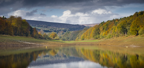
Dam Flask Reservoir

Dam Flask Reservoir

I don't do landscapes as a rule but saw this while out on a shoot and thought I'd give it a bash.

Dam Flask reservoir is located west of Sheffield at the top of the Peak District national park and is possibly one of the most beautiful venues I've had the pleasure to visit for a feature shoot. Autumnal colours help no doubt.

The reservoir is currently about 30ft down on normal levels, such is the effect a dry year has had on waters up and down the UK. This is the area know as the 'Neck End' and the grass you see in the distance is usually underwater - the fact the grass has growns so densely points to how long the area has been dry for.

*Nikon D2x
*Nikon 70-200mm f/2.8 VR
*ISO 200
*1/320th @ f/6.3
*Processed in Lightroom 3 using luminance tweaks plus gradient tool to beef up the sky


For those of you who are interested in how the original .NEF looked, here it is before I did the adjustments in Lightroom 3:


As you can see, there's a big crop to give it that cinematic feel, along with some serious contrast and luminance tweaks. I really like the luminance sliders in LR3 because they can really change how the tonal range looks without much effort, something that fits me as a photographer when I have limited time to get my usual images over to the relevant editors. Sharpening has been done too, plus I've put gradients top and bottom (so they match) and one to the left side of the image so bring out what was quite a big area of shadow in the trees. I'm no Joe Cornish by any stretch but for a quick snap inbetween doing the job at hand, I'm happy.


Sunday 6 November 2011

Hidden Waters

Because it's fishing, because it's a mate in the film, and because it sums up just what fishing can be all about, I had to share this with you guys.

HIDDEN WATERS by Wychwood Fly-Fishing Tackle Design from Wychwood Game on Vimeo.


I've known Wychwood brand manager Paul Richardson, the 'star' of Hidden Waters for some time now through features I've shot with him for Total FlyFisher magazine. He's a great guy, always up for a laugh and to talk crap with, and when he told me he was heading up the the lakes with the Clockwork Cloud team to film, I knew it would be something special. I just love the camera work (all done on a Canon 5D mk2 apparently) and the sense of solitude that the film conveys. We produce angling videos at work - something I'm learning more about each day - but this is a massive departure from any of the tuition-based films that I've worked on and a step in the right direction for marketing the sport of flyfishing.

I've yet to invest in a DSLR that will shoot video, although I'm not helped by Nikon's slow uptake of HD video functionality in its cameras. Canon really do have this sown up at the moment although I can see it being brilliant across the brands within a few years. Filming adds another dimension to stills shoots and can, in many cases with angling, unveil things that just wouldn't come across in a printed form. I know more and more anglers are embracing the internet here in the UK, and with mobile phones playing a big part in accessing web content, this is something I know will be as important in my work in a short space of time. I just need Nikon to get it's thumb out....

Geared Up!

There are a million and one gear-related web posts these days but seeing as this is my day job, I thought I'd show you what gear I use and why:

Cameras
I did my Uni degree on a range of cameras (35mm EOS 650/35mm Nikon FM2/Bronica ETRSi/Mamiya RB67/Cambo 5x4") but for work I've always gone down the (D)SLR route for ease of use. I was on Canon digital but when it came to shelling out for my own gear I went with Nikon, a decision that was born out of wanting better build quality and a more utilitarian interface.
I've gone from a D200 to a pair of D2x bodies that I still use today. Yes, they've old in DSLR terms and yes, they don't have half of the capabilities of some of this year's models. However, they are rugged and in weather that most people wouldn't even contemplate getting their cameras out in, these two just keep on working. I love the fact that many of the major functions are clickable via a button on the top-plate or on the rear - this helps massively in winter when wearing gloves - and was something that drew me to Nikon in the first place. Menu-based options just aren't for me because I have a memory like a sieve so trying to remember shortcuts and whatever just doesn't suit me.

Lenses
I've had all sorts over the past few years but I've now got my kit down to an amount that is both easy to carry (i.e. lightweight) and covers the majority of what I shoot. Currently, this is what's in my Lowepro Vertex 200:

*Nikon 70-200mm VR f/2.8
*Nikon 17-55mm f/2.8
*Nikon 60mm AF-D f/2.8 macro
*Nikon 50mm f/1.8
*Sigma 14mm f/2.8

As you can see, I've gone for fast aperture lenses. yes, they invariably give the best image quality but the other advantage they offer is, what with the D2x having a limited high ISO option (800/1000 is useable), these fast lenses just help me out a little when the light levels drop.

I've had the 10.5mm fisheye, 85mm f/1.8 and the 80-200mm AF-D recently and all were brilliant but either didn't quite offer me what i wanted (the 85mm didn't get used enough, the 80-200mm had slow AF) or were too much of a novelty to be sat in the back in the case of the 10.5mm. That was kept for a year or so and produced some great images, but the money it generated was put to better use at home. Ah, the joys of home ownership.....

At the moments I really couldn't say what my favoiurite lens is, although the 17-55mm gets the most use because it's an allrounder.

What would I like? A 300mm, preferably the Nikon f/2.8 but i would baulk at the f/4 version. The 14-24mm also looks tasty. If I move to FX (which I will soon via a D3 hopefully) then something like the 24-70 will probably end up in my bag.

Flash
This is probably the one area where I've learned the most over recent years and it's where I can see myself spending more money quite soon. I currently have two SB-800s sat waiting to be repaired due to meetings with lakes and rivers, but I've just taken delivery of a new SB-700, which seems okay so far. I also have two SB-28s that work very well as off-camera units combined with Phottix Strato triggers. I use cheap foldable 40cm softboxes and a 28" Westcott Apollo and a few DIY mods.

I could go further into the memory cards, filters, batteries etc but I won't at the moment - these were all bought on price and nothing else so aren't anything fancy and just make me look like a tightarse!!!


The story so far...

So I've just got into blogging and despite being a journo for more time than I care to remember, I'm a bit stuck for what to say.

Anyway, since I took up photography full-time and stepped away from the writing side of things, it's been a hectic two-and-a-half years of car driving, drinking coffee and deciding which route will get me home on time. I've met hundreds of people, seen thousands of signs for new places, and thankfully, only had a few bad days.

So to kick things off, here are some images that show what I do on a day-to-day basis:

Infinity....

The Hungry Trout

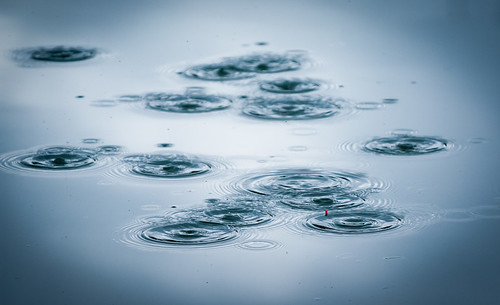
Ripples

The Take

Against The Flow

As you can see, shooting for angling magazines in the UK is my mainstay and is something I love doing.  I've been an angler for as long as I can remember and I suppose I will always be an angler in some form or another, wherever I live.

These are the consumer magazines I shoot for that can be found in places like WH Smith and Tesco:

* Total Coarse Fishing
* Total Carp
* Advanced Carp Fishing
* Match Fishing
* Pole Fishing
* Total FlyFisher
* Total Sea Fishing

As you can see, this is a really varied range of magazines covering all disciplines of fishing in the UK. The great thing for me is I get to see a massive selection of waters that I often get to fish (in between shooting) and that in itself has helped me become a better angler.

I also shoot for three other titles we produce - Tackle & Guns, Tackle Trade World, and Gun Trade World. As you can guess by their titles they are trade publications that don't go out to the general public. To be honest, these three are the ones I do the least amount of shooting for because they are news and review-based magazines so the images are either sent in to accompany the story or stock mages are used. I have done some jobs for them at shooting grounds and trade shows and is something I'm aiming to increase my input into.

If you want to see any more of my work, or just see what I've been getting up to then go to my flickr stream for more of my photography.